In creating a website and blog espousing more mindful technology, I wanted to practice what I preach. The typical website in 2018 is designed to distract. Social media icons encourage an article to be shared before it has even been read. Mailing list subscription forms pop up, regardless of whether you have already subscribed. GDPR cookie notifications cover half the page, and are designed to make it very easy to accept but difficult to decline. As you read, more articles show on the sidebar, trying to keep you constantly engaged. Links stand out brightly, and by the time you finish an article you have ten tabs open ready to read next. Occasionally you’ll click one of the adverts, bringing in a little revenue to the site owner.
Naturally, in this environment, you don’t really read at all, you just scan. You get the gist of an article, then think that you should come back and read it properly later, before getting distracted by something else. It’s easy to spend an hour doing this, not really taking in much at all. It’s like walking around a library looking over the shelves – not entirely pointless, but you’ll never gain deep understanding of anything.
Mindful web design
So what were the design and UX (user experience) decisions taken to make mindful.technology an example of mindful web design? The site only launched this month, so I do expect to refine the design over time, but I have tried to include the core design elements from the beginning. I hope this site will serve as an example of good mindful web design. If other sites were to follow some of the same principles, our online web browsing experience could better support us living in mindfulness.
One of the main principles was minimalist design. I was struck by the design of zenhabits.net which because increasingly minimalist over the years. I wanted a slightly different approach for this site, more of a magazine feel, but minimalism would still be at the core of the design.
Navigation
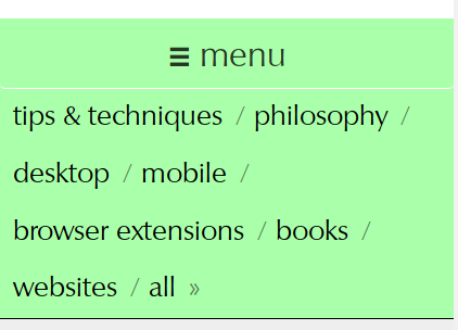
The site features a simple top navigation bar, which are the categories for the articles on the site. Here I used a principle from by long distance-hiking experiences: everything you include should have two functions. The secondary function of the navigation bar is that it helps visitors to understand the topics covered by mindful.technology.
Empty space
Many websites try to fill every inch of the page with something that can be clicked on. But in the best creative works, from the classical music of Mozart to Stanley Kubrick’s film masterpieces, empty space is often just as important as the space used. Can we do the same for websites?
Empty space emphasises the elements that remain. This is unfortunately not so mainstream and rather rare in today’s films and musical hits, but I believe that makes it all the more refreshing when we encounter this approach. In the context of a blog with some philosophical content, empty space also symbolises having space to think.
Distraction-free reading experience
Many web browsers now have a distraction-free reading mode, which hides everything but the main content of the page you are reading – this is a great feature! The only problem is, you have to remember to open it. It’s better if the page is designed to be distraction free for everyone, whether or not they remember to hit the reading mode button. So articles on this site do show any distracting sidebars, clickbait, or adverts.
Ad-free
Advertisements are some of the most distracting and annoying parts of the online experience. Adverts which use behavioural targeting are even more annoying, when adverts follow you around the web, typically for a product you decided not to purchase or already did!
This is an ad-free site. I’m willing to give up a possible income stream for this point of principle.
I don’t rule out less distracting forms of promotion. When I review a book or app, the page may include an affiliate link to buy the product, where I would receive a small percentage of the purchase. There might also be promotions in future that would be relevant (for example if I were to write a book) – but if I ever do this, the promotion would extremely limited and sensitively designed.
Privacy
Since I’m not keen on advertising, I did not want this site to be giving data about your browsing habits to advertisers, as many sites do (often without the owners even realising it). I also didn’t want to have a big cookie notice every time a new visitor comes to the site – so this site simply doesn’t use cookies for normal browsing (only for specific functionality, as explained by our privacy policy).
Links
Hyperlinks are one of the defining features of the World Wide Web – and something the underlying network (the Internet) didn’t have before the Web came along. They played a huge role in making the Web such a successful and ubiquitous platform.
But links are also distracting. Every link in an article presents a decision for the reader – to click or not to click – which breaks the reader out of the linear narrative.
I chose a subtle colour for links, and I don’t use many of them. This is an area I’d like to explore more in future – how to we take advantage of links without them being so distracting? There may be more optimal approaches.
No unnecessary information
I’ve tried to limit the information shown on the site to the essential. Each article shows the title and author at the top. Other details like date and image credits are shown less prominently, at the bottom.
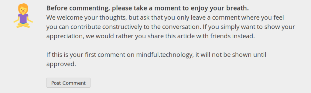
Mindful commenting
The comments section on many sites is often a terrible waste of time. I considered not having one. Instead, I took a different approach – allow commenting, but remind users to “be mindful” before they post it. I am hoping that this will ensure the quality of comments is higher. I fully expect this approach to reduce the number of comments, but that’s fine: I’d rather have a few thoughtful comments than hundreds of mindless ones.
Social media strategy: to boycott or to engage?
Social media is one of the most distracting elements of the online experience. I considered boycotting social media entirely for this site, as most social media represents the kind of online experience I think we need to move away from.
Instead I decided to engage with social media in a limited way. I created social media profiles for mindful.technology. But I don’t heavily promote those from the site. There are no social media icons except for on the About and Contact pages. I do want to attract people from social media to read the site – as those are some of the people who may benefit most in learning to have a less distracting online experience!
Since we’re on the subject of social media, I’m going to take the opportunity to cheekily ask you: please can you take a moment like/subscribe/follow the mindful.technology social media profiles? We have Facebook, Twitter, Google Plus, Instagram, and a Reddit subreddit. Also an email newsletter if you’re interested.
Future plans
I’m planning to explore this topic more in future, as I believe the online experience is really poor at the moment. This might involve highlighting examples of good mindful web design elsewhere on the web, and perhaps developing guidelines for site owners and web designers.
Over time I also hope to refine the design of this site to be an even better example of mindful web design. If you have any suggestions I’d love to hear them.

I began reading this article in Pocket’s reader, but since the whole point of the article was to see how you practice what you preach I decided to come to the site to read it. And I would like to say that I was not disappointed. In particular I applaud the lack of links and ads. From one developer to another, keep up the good work.
Thanks! I’ve actually never tried Pocket but using that or similar services such as Instapaper or a browser’s reader mode definitely help make the web a more pleasant environment!
I’m interested in exploring whether it’s possible to extend that concept to adapt the entire structure of a website (including navigation elements) into a more standardised and distraction-free format (rather than just a single article).